Three Creative Elements Email Marketers Must Test in 2021
By Jeff Cracolici
Marketing Manager & Digital Expert
As a marketer, your email list is one of the most powerful tools in your arsenal. In order to keep performance strong, it’s important to keep the look and feel of your emails fresh with new creative elements and features.
Here are three creative items you should test in 2021.
1. Call Now or Text Now Buttons
According to research by Hubspot, 46% of emails are opened on mobile devices. This presents an interesting opportunity on how email recipients can take action. Sure, you can send them to a webpage or online form, but a better option is to offer them a button that initiates a call or a text message (SMS) right from the email creative. Mobile users want to continue using their devices, even if the viewing space is limited. Giving them the option to interact almost instantly with your brand can be enticing.
How is this done? Through a simple and specially-formatted HTML hyperlink. Here is a great resource that goes into detail.
For modern smart phones, when a phone number link is clicked the phone will open the dial pad with the number automatically populated. When a SMS link is clicked, the phone will open in the default messaging app. You can even include a default message to make it easier for your visitors to engage with you. Combine this with responsive design to only display the “Text Now” link on appropriate devices.
Additional Tip: It’s important to make sure your email’s links and buttons are easily “clickable” by a finger on a touch screen. To account for this, make sure they are at least 60 pixels wide or at least 60 pixels tall.
2. Simple Text-Based Navigation
Most businesses now include a version of their website’s navigation menu in their emails. This allows the reader to jump to the appropriate location on their website to shop for products.
Due to the limited real estate on email creative, there are a few things you can implement to improve the experience of your nav menus. First, limit the number of navigation options. Some companies keep this to their primary categories—three or fewer is usually best. This allows you to make the navigation large enough to read and interact with while keeping it on a single line on all devices.

Via: https://www.displayblock.com/2015/08/19/responsive-design-options-for-navigation-in-emails/
You can also implement a multi-line navigation option, which is helpful for when you have more than three categories. If this is the case, you may want to avoid the navigation menu on top of the email. Consider one of the following places:
- Under your primary offer
- At the bottom of the email
- Split it out – some at the top and some at the bottom
If all else fails, you can have two sets of navigation sections; one for desktop and one for mobile. Through responsive design, only display the appropriate one depending on the user’s device.
Want To Boost Marketing R.O.I. & Find New Customers?
LaunchPad by LiftEngine allows brands to create unlimited marketing audiences using hundreds of client RFM, demographic, lifestyle, and interest data elements to run highly-targeted, higher-performing campaigns. Create audiences for acquisition too.
Learn More3. Animated GIFs Instead of Static Images
According to EmailMonday.com, many people who check emails on their mobile devices delete poorly formatted messages within three seconds. Long blocks of text without images, visual cues, or anything to draw the reader in are some of the worst offenders.
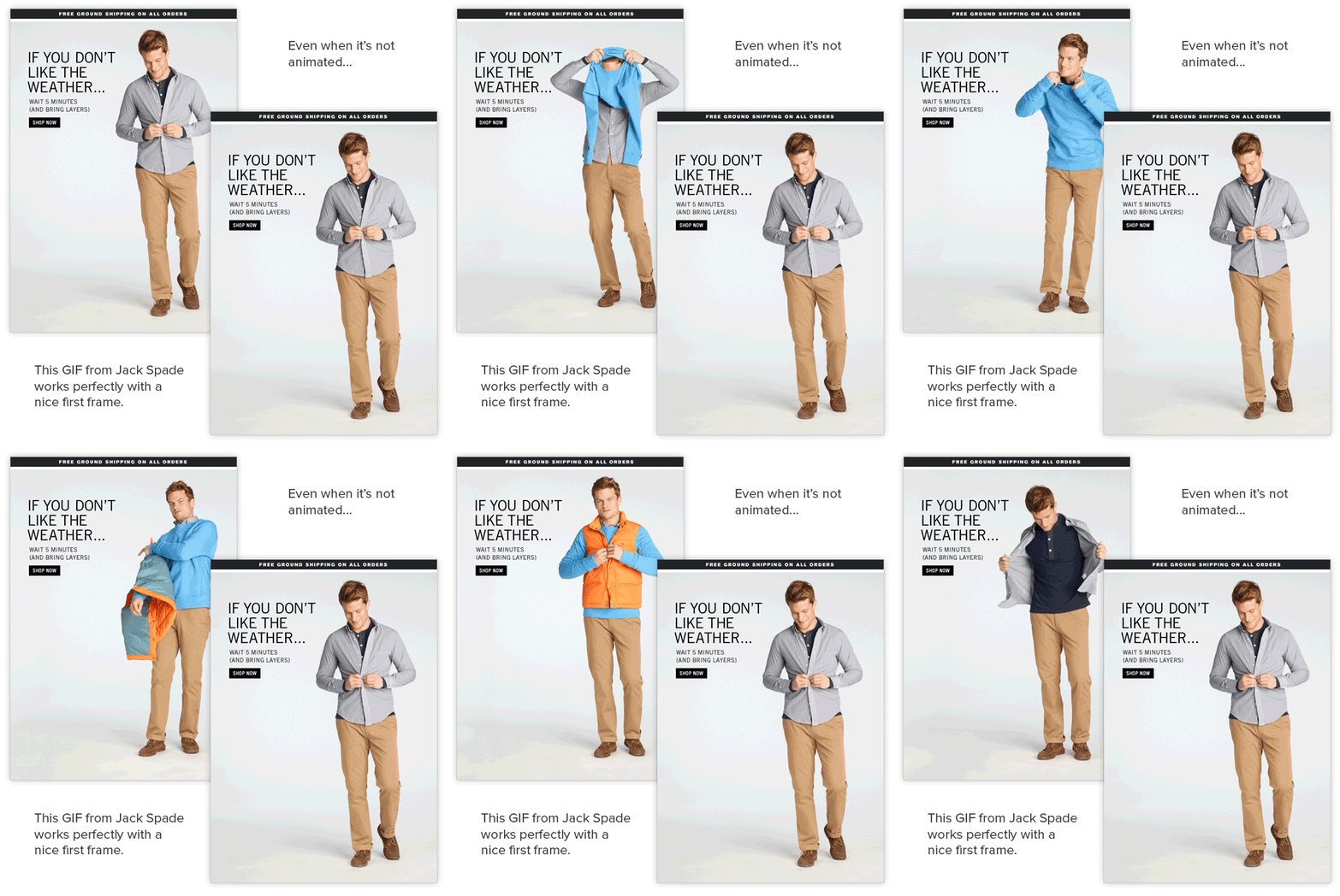
If the image assets you are using are experiencing creative fatigue, consider using GIFS to add some movement to the email creative and grab your reader’s attention quickly.

A nice render of a GIF in an email, via Litmus
There are many services online that can take existing video files and turn them into GIFs, so chances are you can do this with creative you already have. Also, there are a bunch of websites out there that offer pre-made GIF memes, or other humorous elements. It’s important to exercise caution when using 3rd party content. You want to ensure they are appropriate for your audience and consistent with your company’s brand image.
About LiftEngine
Since 2005, LiftEngine's primary mission has been to help clients better understand and connect with their most responsive prospects and customers, online or offline. Our expertise is behind the marketing campaigns of 400+ clients.
Behind LiftEngine is LiftBase, our proprietary addressable consumer database. Comprised of 250 million US consumers, 140 million US households, and 1,000+ enhanced data elements, LiftBase powers our audience development services and industry-leading products, PortalLink and LaunchPad.
Published on Feb. 03, 2021, Last Updated on Jul. 19, 2022